Overview
tyGraph for SharePoint provides detailed analytics into the sites, pages, and files that make up your intranet. Value is added by providing HR and organizational information to the data with additional context provided through geography and time scale data points. This in turn helps transform simple data into information that can inform decision-making. SharePoint analytics are provided at the tenant level for a strategic view of the data that can be drilled down into, the site (tactical level) and finally to the file/page level for an operational view of the data within your intranets. tyGraph for SharePoint is where you understand collaboration and track the performance of your organization's investments in SharePoint.
This is a summary of all visual help tips in the latest tyGraph for SharePoint report. All tooltip items are brief descriptions of the visual and calculation, limited to 250 characters. You can see the visual help tip appear by hovering over any visual card in Power BI. Bolded “Help – “items indicate help tips that are backed by a tooltip page.
CONTENTS
- Overview
- Setting Parameters in the Power BI Workspace
- Universal Report Header
- Content Overview
- Collaboration Scorecard
- Page Audience
- Executive Summary
- Site Collection Summary
- Content Navigator
- Site Detail
- Inactive Content
- External Activity
- Sync Activity
- File/Page Detail (Drill-through)
- File Type Activity
- FAQ
- Reference
- Activity Type Table
Setting Parameters in the Power BI Workspace
Custom filtering of URL names as a wildcard can be configured in the Power BI workspace settings. For more information please see this article Setting URL Name as a Wild Card Parameter in tyGraph for SharePoint : Support
Universal Report Header

- Our Logo will redirect you to our website: https://tygraph.com/
- This is the title page
- Rocket Icon: A shortcut filter to show only pages created recently, also opens a hidden date slicer that allows for date adjustment to this specific filter. To return to the normal data view click the same icon that is now the curly arrow.
- Search Field: Enter in words that pertain to information in the below visuals and matrixes to filter by keyword.
- Box Icon: Hover over this to see the version of the report and database information. Click on this button to go to the tyGraph Dev Blog, where you can learn about changes/additions to the report.
- Shows the parameters that define the scope of the report.
- Information Icon: Looking for more information? Click here for detailed articles and terms on our website! This will redirect you to our support site: https://support.tygraph.com/
- Date Slider: This is a rolling filter that is enabled by default. Use this to select a rolling range of recent dates. You can erase this slicer to select specific dates (below) outside the rolling range. You can glance to the “Report Period" element at any time to see the overall filter.
- Harvest Date: This is the most recent datapoint collected by tyGraph. If the date is behind what you expect, check if the dataset has refreshed. If you are in tyGraph Online, please contact support or your Admin immediately.
- Set a variety of filters to narrow the scope of the data.
Content Overview

- The total unique engaged sites with views in the report period.
- This is the percentage change in viewed sites from the previous period to the current one. The previous period is the range of dates behind the current period for the same number of days. For details see our support site definition.
- Churn % tells you the percentage of users who stopped viewing content this period. This is calculated from the number of users that did not view this period but did in the prior period divided by the total previous and current viewers.
- The total unique page viewers. You can click on the neighboring data bars to see this based on a specific context like page viewers for a top site or page.
- The percentage change in unique viewers from the previous period to the current one. The previous period is the range of dates behind the current period for the same number of days. For details see our support site definition for previous period.
- This is the total number of page views for the report period. This will count each time someone loads a page. If you love a page and keep going back to it, then this is your kind of measure!
- The time with the peak number of unique page viewers. You can click here to see a detail plot below. The time zone is always UTC for this model.
- Sites ranked by the total unique viewers in the report period.
- See All Sites
- To drill through to Site Detail, select a single data point from Site Title & URL, Site URL, SiteCollectionSPWebUID or SPWebUID
- Top pages ranked by the unique page viewers. If someone views the same page multiple times in the same period they are only counted once.
- See All Pages
- To drill through to Page Audience, select a single data point from Object Name and ID or SPWebUID
- The day with the peak number of unique page viewers.
- Shows the total number of pages created.
- The total unique users with views in the report period.
- Engaged Users and total Users by organizational hierarchy.
- Engaged Users and total Users by organizational hierarchy.
- Content Overview Page - SharePoint Site File Activity Hierarchy by Unique File Users Totals: A matrix style visualization that allows one to sort SharePoint sites by the most unique file users and using the plus symbols for each site drill down into the underlying file and site hierarchies that exist.
Collaboration Scorecard

Collaborative Users: Have modified or shared a file with a colleague.
Non-Collaborative Users: We compare this with users who are simply viewing content (preview, access etc).
- Map view
- Table view
- Network view
- This window will show information based on the view you have selected.
- The time with the peak number of unique page viewers. You can click here to see a detailed plot below. The time zone is always UTC for this model.
- Sites ranked by the total unique viewers in the report period.
- The day with the peak number of unique page viewers.
- Collaborative Users and Non-Collaborative Users definition card.
- Unique users who have downloaded, modified, or shared a file.
- The number of unique page viewers over time. This visual contains a dynamic date hierarchy allowing you to change bottom axis to fit your situation. Use the double down arrow to move down and the up arrow to move up.
- Card displaying the average number of collaborative users that have modified or shared a file with a colleague.
- This is the calculated percentage change in collaborative users per file, this is a dual field that shows the percentage along with a trend icon indicating either up or down.
- A card displaying the total unique non-collaborative users along with the percentage change calculated and a trend icon indicating up or down.
- Sites ranked by the total unique viewers in the report period.
Page Audience

- Click here to see an exact list of past/current viewers, users lost/gained, and first-time viewers.
- The total unique users who viewed a page or pages for the report period.
- The percentage change in unique page viewers (shown left) from the previous parallel period to the current report period.
- The number of unique users who stopped viewing the page or pages in this report period.
- The number of unique users who did not view the page(s) in the previous parallel period but viewed in this report period.
- The percentage of unique viewers lost vs gained between the previous parallel period and the current report period. The lower your churn the better. Pages or sites with increased viewers but high churn are gaining users inefficiently.
- A list of total page views, unique page viewers, and first-time viewers by user organization. This visual contains a dynamic hierarchy which allows you to use the up and double down arrows to change the aggregation all the way down to user email.
- Total page views and unique page viewers by page.
- This is a 'User Attributes' slicer that is populated with user attributes from the user table, this table gets its information from Azure active directory such as city, job title, department, etc. You can use this slicer to dynamically manipulate the matrix below it for exceptional data exploration. Dig in deep to find out who is viewing pages, and who has stopped viewing pages.
- A matrix that is controlled by the above "User attributes" slicer. Allowing you to analyze your total viewership, unique viewership, viewers lost and viewer churn percentage by 12 different users contexts.
- This is a slicer that allows you to dynamically configure dates for the Total Activity line graph.
- This is a slicer that allows you to dynamically configure the legend to populate with user attributes for the Total Activity line graph. For detailed information on the 'User Attributes' feature please see this article User Attribute Selections : Support (tygraph.com)
- This is a slicer that allows you to dynamically configure activity types for the Total Activity line graph.
- A dynamic line chart plotting total SharePoint page activity that can be configured in multiple ways from the above three data slicers. Gone are the days of hard-to-find drill through icons, dynamically change the X-Axis using the drop-down fields from above.
Executive Summary

- Shows a brief overview of the sites with the most activity.
- View the overall trend of the activity you have selected.
- Compare activity across different sites.
- Compare the number of active sites against the total number of sites.
- Compare the number of licensed users against the number of active users.
- This window will display different information based on the tab you have selected.
- Shows the total activity for the last full month, based on the activity you have selected.
- Shows the change in activity from month to month.
- Shows the number of inactive sites.
- Shows the number of inactive pages.
- Shows the percentage of pages that are inactive.
Site Collection Summary

- A bar chart displaying a count of the number of sites containing certain sensitivity labels. This will change depending on which of the categorical buttons are selected from the above row.
- Site count based on site type, i.e. Teams, Yammer, Classic, or Modern
- Total storage usage in Gigabytes with overlayed sum of total sites.
- Drill into your most active site collections. Teams and Yammer icons identify respective connected sites. If you right click on any row you can drill through to the site collection detail page.
Content Navigator

- Shows the engagement of Site Collections compared to the total number of Site Collections.
- Shows the engagement of Sites compared to the total number of Sites.
- Shows the engagement of Users compared to the total number of Users.
- Shows the engagement of Guest Users compared to the total number of Guests.
- Gives a list of sites with various statistics on the activity, including a total of activity across all sites.
- Shows downloads for each country.
- Shows the number of unique modifiers for each country.
Site Detail

This is a page designed to allow you to survey activity with key sites. It also is a drill-through page designed to show details on a site collection. Users can land here when drilling through the site collection visual at the bottom of the Site Collection page.
- The total unique sites with activity in the report period. You can control what activities are counted toward an engaged site in the bottom left “Activity Name” filter.
- The total unique users with activity in the report period. You can control what activities are counted toward an engaged user in the bottom left “Activity Name” filter.
- The total unique users who viewed a page in the report period. Many customers like to use unique page viewers as the gold standard for users reached by an article or page for a given period because it is not affected by repeat views.
- Total of page views, all time views, and unique viewers by page.
- This provides detail about who is taking what activities within your site or sites. This visual contains a dynamic organization hierarchy which allows you to use the up and double down arrows to change the perspective.
- See your top sites and understand what they are used for at glance. Some sites may be more popular for document usage where others may have high page views. By default, we rank sites by the unique users they attract for either reason.
- Total of all tyGraph for SharePoint captured activities for each file with a link to that file.
- This is a data slicer that contains fields pertaining to SharePoint files and sites that can be compared in the line graph that it is embedded in.
- X-Axis data slicer that enables a dynamic x axis on the line chart its embedded in eliminating the need to use the standard power bi drill down icons.
- Total of all tyGraph for SharePoint captured activities for files and sites over time. This visual contains a dynamic date axis which can be manipulated X Axis data slicer and can be configured for different files and sites with the Legend slicer.
Inactive Content

- Here you can filter inactive content based on the number of days it has been inactive.
- Number of inactive Classic SharePoint Sites.
- Number of inactive Unassociated Modern Sites.
- Number of inactive Teams Sites.
- Number of inactive Yammer sites.
- Gives an overview of various statistics on inactive sites. This can provide insights on resources that could be freed, or reallocated to more active areas.
- Displays the sites with the most inactive pages.
- Shows inactive pages based on the last date they were viewed, and who viewed them.
External Activity

- An external user is a user with activity who is not listed in your active directory. An engaged user has taken any activities in tyGraph for SharePoint. For a full list of activities, see the All Activities on the FAQ page.
- This slicer utilizes the new Power BI feature field parameters, which enables the dynamic comparison of multiple columns (fields) within the line chart it is embedded in. This particular slicer is loaded with fields that pertain to the sites, hubs, and activates that external users would use in SharePoint.
- This is another field parameter enabled slicer that allows for dynamic manipulation of the x-axis on the line chart visualization for external activity.
- All activities for external users by date. For details how external users are defined, see the help tip on the title of this page.
- Matrix showing site owner, which can be a group or user. Also indicates if the site is active or not, the sensitivity label of the site, an activity count by Internal or guests and a link to the associated URL.
- External users are people we have captured activity for but are not listed in your Active Directory.
If an internal user is listed on this page, please add them to your active directory and they will no longer be flagged as external. The domain of a user does not mean they are internal/external.
For example, a vendor could have an email address that belongs to the organization (@tygraph.com) but is not necessarily an internal user.
Sync Activity

- Total activities where the activity type was sync. This includes: FileSyncDownloadedFull, FileSyncDownloadedPartial, FileSyncUploadedFull.
- Total files with sync activity against them. Sync activities include: FileSyncDownloadedFull, FileSyncDownloadedPartial, FileSyncUploadedFull.
- Total sync upload activities (FileSyncUploadedFull)
- Total sync download activities (FileSyncDownloadedFull)
- Total sync activities over time. This visual contains a dynamic date axis which can be manipulated using the drilldown icons in the visual header.
- Sync activities for each site.
- Sync activity by user.
File/Page Detail (Drill-through)

- All unique users from within your tenant who had activity against this selected, site, or object.
- All unique users from outside your organizations tenant who had activity against the selected site or object.
- Total of activities where the type was sharing. This includes: AccessRequestCreated, AddedToSecureLink, CompanyLinkCreated, SecureLinkCreated, SharingInvitationAccepted, SharingInvitationCreated, SharingRevoked, WACTokenShared.
- Total of all activity.
- This visual contains a dynamic date axis which can be manipulated using the drilldown icons in the visual header.
- Activity by user and type on the selected object. Be sure to see the Latest Activity Date. Don’t forget to verify the harvest date as this will only move forward with the latest data refresh.
- Total nominal activities by user.
- All activity by specific activity name. (Most detailed level)
File Type Activity

- A matrix displaying content type counts per site, with corresponding site title and URL.
- This is a fun funnel graph that shows total activities by content type represented as a graph but containing a dynamic axis. This means you can drill down within content type and see the file types.
- This slicer utilizes the new Power Bi feature 'Field Parameters', which enables powerful filtering abilities within the matrix below. This data slicer is loaded with fields pertaining to which types of users have file actions, some of the fields include User City, User Department, and User Job title, play around with it to explore its powerful functionality. For a detailed article on 'User Attributes' please see this article User Attribute Selections : Support (tygraph.com)
- This is a matrix displaying counts on different file activities per user. File activities are defined as files that have been deleted, moved or shared. This matrix can be filtered by the above data slicer and is a dynamic matrix that is configurable to whichever data view suits your purpose.
- Another slicer utilizing Power BI's new feature, this is loaded with data pertaining to file types, objects, and hubs within SharePoint and is used to configure the line chart its embedded into.
- An X-axis date slicer that allows for dynamic manipulation of the corresponding line chart, play around to see different views of file activity.
- This is a dynamic line chart displaying file activity counts and is configurable by the two slicers - Compare By, and X-axis.
FAQ
Confused by a visual? Hover over any header for a contextual tip. https://datadictionaryimages.blob.core.windows.net/datadictionaryimagescontainer/HelpTipGIF.gif
Have a question?
Email our support team. support@avepoint.com
Check out our full Data Dictionary in tyGraph Online - https://home.tygraph.com
What activities do you collect?
Check out the "Activity Name" in the right table for a full list of activities we collect.
What activities classify as Sharing or Sync?
Check out the Activity type column in the chart on the the[MS3] right to see which activity types qualify for sharing, sync, or usage[MS4] .
Why is a Collection, Site [MS5] or User Engaged?
A collection, site, or user with any of the right activities for the report period will be counted once regardless of activity volume.
What activities do you count for files?
We have a file Usage flag (furthest right column) in the right chart. Any activity with "true" is counted.
All Activities are listed in the Centre Table. See Activity Type Table (Error! Reference source not found.) on the References page
Have questions about Power BI? - https://docs.microsoft.com/en-us/power-bi/service-basic-concepts
How do I export data?
You can export any visual in Power BI by clicking the visuals ellipsis, then export data. You can export 30,000 rows to a csv, and up to 150,000 rows to an xls.
Can I explore deeper into a datapoint?
Many visuals have drill through "focus" pages or analytical insights that will explain trend changes. Right click on a data point of interest and look for "Analyze" or "Drillthrough"
Why is my data blank?
If a visual is not showing what you expect, hover over the visual and a filter icon will appear. Hover over the filter icon and a pop up will show you all filters currently applied to that visual. If there are no filters check the Harvest Date.[MS6]
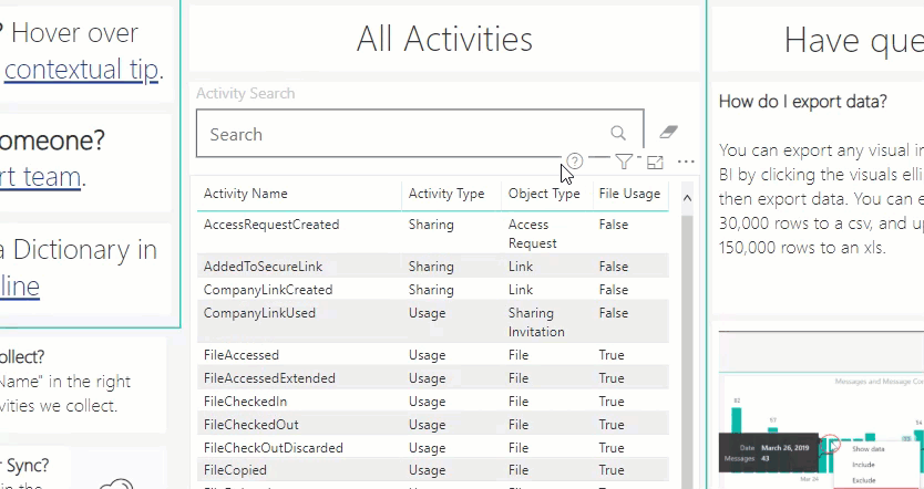
Reference
Activity Type Table
Activity Name | Activity Type | Object Type | File Usage |
AccessRequestCreated | Sharing | Access Request | FALSE |
AddedToSecureLink | Sharing | Link | FALSE |
CompanyLinkCreated | Sharing | Link | FALSE |
CompanyLinkUsed | Usage | Sharing Invitation | FALSE |
FileAccessed | Usage | File | TRUE |
FileAccessedExtended | Usage | File | TRUE |
FileCheckedIn | Usage | File | TRUE |
FileCheckedOut | Usage | File | TRUE |
FileCheckOutDiscarded | Usage | File | TRUE |
FileCopied | Usage | File | TRUE |
FileDeleted | Usage | File | TRUE |
FileDownloaded | Usage | File | TRUE |
FileModified | Usage | File | TRUE |
FileModifiedExtended | Usage | File | TRUE |
FileMoved | Usage | File | TRUE |
FilePreviewed | Usage | File | TRUE |
FileRenamed | Usage | File | TRUE |
FileRestored | Usage | File | TRUE |
FileSyncDownloadedFull | Sync | File | FALSE |
FileSyncDownloadedPartial | Sync | File | FALSE |
FileSyncUploadedFull | Sync | File | FALSE |
FileUploaded | Usage | File | TRUE |
FolderCreated | Usage | Folder | FALSE |
FolderDeleted | Usage | Folder | FALSE |
FolderModified | Usage | Folder | FALSE |
FolderMoved | Usage | Folder | FALSE |
FolderRenamed | Usage | Folder | FALSE |
FolderRestored | Usage | Folder | FALSE |
PageViewed | Usage | Page | FALSE |
PageViewedExtended | Usage | Page | FALSE |
SecureLinkCreated | Sharing | Link | FALSE |
SharingInvitationAccepted | Sharing | Sharing Invitation | FALSE |
SharingInvitationCreated | Sharing | Sharing Invitation | FALSE |
SharingRevoked | Sharing | Sharing Invitation | FALSE |
SiteCollectionCreated | System | Site Collection | FALSE |
SiteDeleted | System | Site | FALSE |
VideoRequested | Usage | File | TRUE |
WACTokenShared | Sharing | Token | FALSE |